Guide to Learning Data Visualization Tools
Leveraging Data Visualization Libraries for Coding Proficiency
Choosing the Right Visualization Library
Selecting the appropriate data visualization library is crucial for effectively communicating insights from your data. Libraries like Matplotlib, Seaborn, Plotly, and Tableau offer varying levels of customization and complexity. Matplotlib provides a foundational understanding of plotting mechanics, while Seaborn builds upon this with more aesthetically pleasing and statistically informative visualizations. Plotly excels in interactive plots, making it ideal for dynamic dashboards, and Tableau is a powerful choice for business-oriented visualizations and collaborative data exploration. Careful consideration of your project's needs, desired level of customization, and intended audience will help you choose the best tool.
Understanding the strengths and limitations of each library is key to efficient data visualization. For instance, while Matplotlib offers extensive control, it might require more code for complex visualizations. Conversely, libraries like Seaborn automate many aspects of plot creation, making them faster for exploratory data analysis. The choice should ideally balance the need for control with the desire for speed and efficiency.
Mastering Fundamental Plotting Techniques
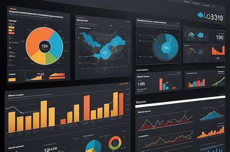
Proficiency in fundamental plotting techniques is essential for any data visualization endeavor. Learning how to create line plots, scatter plots, histograms, and bar charts forms the bedrock of data storytelling. These plots effectively display trends, relationships, distributions, and comparisons within your dataset. Understanding how to manipulate plot elements like labels, titles, legends, and annotations is equally important for creating compelling and informative visualizations.
Exploring Advanced Visualization Types
Beyond the basics, exploring advanced visualization techniques like box plots, violin plots, heatmaps, and network graphs unlocks deeper insights. Box plots reveal the distribution and spread of data, while violin plots provide a combination of box and kernel density estimations. Heatmaps highlight correlations and patterns within datasets, and network graphs visualize relationships between entities. Learning these more complex visualizations expands your ability to uncover nuanced patterns and communicate intricate relationships effectively.
Data Preparation for Effective Visualization
Data preparation is often the most time-consuming but critical step in visualization. Proper cleaning, transformation, and formatting of data are essential for generating accurate and reliable visualizations. Handling missing values, outliers, and inconsistent data formats is crucial for ensuring that the visualization accurately reflects the underlying data. Cleaning and transforming data not only improves the visual representation but also ensures that insights derived from the visualization are reliable and meaningful.
Interactive Visualization and Dashboards
Interactive visualizations and dashboards are becoming increasingly important for data exploration and communication. Libraries like Plotly empower users to create interactive plots that allow for zooming, panning, and filtering. These interactive components greatly enhance user engagement and allow for dynamic exploration of data. This capability is vital for creating compelling data stories and enabling users to draw their own conclusions.
Customizing Visualizations for Clarity and Impact
Effective visualization goes beyond simply plotting data. Customizing visualizations is vital for conveying insights clearly and compellingly. This includes adjusting colors, fonts, labels, and legends to enhance readability and visual appeal. Choosing appropriate color palettes, ensuring sufficient contrast, and using legible fonts are crucial for creating visualizations that are not only aesthetically pleasing but also easily understandable. Understanding design principles is key to creating impactful visuals that effectively communicate your findings.
Integrating Visualization into a Data Science Workflow
Integrating data visualization into your data science workflow is crucial for effective communication and analysis. Visualization tools should be seamlessly incorporated into the process of data collection, cleaning, exploration, and modeling. Data visualization should not be an afterthought but an integral part of each step. Visualization aids in identifying patterns, anomalies, and potential problems in your data, leading to better informed decisions and insights. This integration streamlines the entire workflow, making the data science process more efficient and effective.
Interactive Data Exploration and Dashboards
Interactive Data Exploration Techniques
Interactive data exploration is a crucial aspect of data analysis, allowing analysts to delve deeper into datasets and uncover hidden insights. It involves using tools and techniques that enable users to manipulate, visualize, and interact with data in real-time. This dynamic approach empowers analysts to explore different perspectives, identify patterns, and formulate hypotheses more effectively than traditional static data analysis methods. Interactive tools can reveal trends and anomalies that might otherwise go unnoticed in large datasets. By allowing users to filter, sort, and drill down into specific data points, these tools facilitate a more intuitive and comprehensive understanding of the information.
The beauty of interactive data exploration lies in its iterative nature. Analysts can quickly adjust their focus based on initial findings, exploring new angles and refining their understanding of the data. This iterative process enables a more comprehensive and nuanced understanding of the data and the insights it holds. Interactive dashboards and visualizations play a vital role in this process, allowing users to easily modify parameters and observe the immediate impact on the displayed results. This flexibility is a significant advantage over static reports, which often lack the ability to adapt to evolving questions and explorations.
Data Visualization Tools for Enhanced Exploration
A wide array of data visualization tools are crucial for interactive data exploration. These tools enable users to transform complex data into easily digestible visual representations. Visualizations help uncover hidden relationships and patterns that might be difficult to discern from raw data tables. Effective visualization tools allow analysts to create charts, graphs, and maps that highlight key trends, outliers, and correlations. This visual representation often simplifies complex data, making it easier for analysts to grasp the underlying patterns and insights.
Specialized tools often offer interactive features that enable users to zoom in on specific areas of a chart or map. This level of detail is critical for identifying granular insights and understanding the nuances within the data. Moreover, these tools often incorporate drill-down capabilities, enabling users to delve deeper into specific data points within a visualization. This level of interactivity fosters a more in-depth understanding of the data and allows for a more comprehensive analysis.
Interactive data exploration tools and visualization techniques are powerful tools in any data analyst's arsenal. They facilitate a more in-depth understanding of the data and the insights it holds. These tools are invaluable for businesses seeking to gain a competitive advantage through data-driven decision-making.

Read more about Guide to Learning Data Visualization Tools

![Best Online Courses for Learning [Specific Creative Skill, e.g., Illustration]](/static/images/32/2025-06/SpecializedCoursesforSpecificIllustrationStyles.jpg)

![Guide to Applying for University Scholarships [Worldwide]](/static/images/32/2025-06/DemonstratingFinancialNeed28ifapplicable293ADocumentingYourSituation.jpg)

![Best Online Courses for Learning [Specific Software, e.g., Excel]](/static/images/32/2025-07/AdvancedExcelCourses3ADataAnalysisandAutomation.jpg)
Hot Recommendations
- How to Stay Productive While Working Remotely
- Tips for Managing Conflict with Coworkers
- Entrance & Certification Exams (升学考试)
- How to Improve Your Storytelling Skills (Speaking)
- How to Find Profitable Side Hustles
- Tips for Preparing for the TOEFL iBT Home Edition
- Guide to Switching Careers from [Industry A] to [Industry B]
- How to Run an Effective Hybrid Meeting
- Tips for Marketing Your Side Hustle on Instagram