Guide to Delivering Persuasive Presentations
For data presentation, follow the three-second rule: viewers should grasp the key insight from your chart before you finish saying its title. Simple beats sophisticated when it comes to visual communication. A single bold number with context often proves more memorable than a complex multi-axis graph.
Remember that color carries meaning. Blue conveys trust, red signals urgency, and green suggests growth. Use this psychological shorthand to reinforce your message subtly. And always check that your color choices maintain sufficient contrast for visibility in various lighting conditions.
Practicing and Refining Your Delivery
The difference between good and great presentations often comes down to muscle memory. Your goal isn't to memorize words, but to internalize flow. Practice while walking, or better yet, record audio-only rehearsals to focus on vocal delivery without slide dependence.
When practicing, pay special attention to transitions between sections—these verbal bridges often reveal where your content needs smoothing. Notice where you naturally speed up (usually when less confident) or slow down (when most engaged), and adjust accordingly.
For tech-heavy presentations, create a disaster kit: offline copies of slides, backup clickers, and printed speaker notes. The most polished presenters aren't those who never stumble, but those who recover seamlessly when things go wrong.
Mastering Visual Aids for Enhanced Engagement
Choosing the Right Visuals
Visual selection begins with understanding your audience's visual literacy. Technical teams might appreciate detailed schematics, while executives often prefer high-level metaphors. When in doubt, ask: What would make this concept instantly clear to my grandmother?
Crafting Compelling Charts and Graphs
Data visualization follows the less ink, more insight principle. Remove gridlines unless absolutely necessary, label directly on data points when possible, and use annotations to highlight what matters. Your chart should answer a question before the audience asks it.
Designing Engaging Infographics
Effective infographics use visual hierarchy to guide the eye. Place your most important statistic in the top-left (where Western readers start), use size contrast to show importance, and leave ample white space around key elements. Remember: people remember visuals attached to emotions, so include images that trigger recognition or surprise.
Utilizing Effective Images and Photographs
Authentic beats stock every time. When possible, use original photos from your work rather than generic office scenes. If using stock imagery, look for photos with imperfections—slightly crooked ties, messy desks—that suggest realism. For technical subjects, before/after comparisons or process sequences often communicate more effectively than standalone images.
Mastering the Art of Typography
Font pairing follows the contrast with harmony rule—combine a strong sans-serif for headers with a highly readable serif for body text, or vice versa. For screen presentations, increase letter spacing by 10-15% for better readability. Your font choices should whisper professionalism, not shout personality.
Incorporating Interactive Elements
Turn monologues into dialogues with strategic pauses for audience input. Simple techniques like turn to your neighbor and share one takeaway or live polling (even with raised hands) dramatically increase engagement. For virtual presentations, use the name and claim method—call on specific participants by name to maintain attention.
Maintaining Visual Consistency
Create a style guide for your presentation: three main colors (one dominant, two accents), two fonts, and standard padding measurements. Apply these consistently across all slides. Consistency doesn't mean monotony—vary layouts within your framework to maintain interest while keeping the overall look cohesive.
Vertical solutions demonstrate how constraints can spark creativity. Just as climbers use walls to build strength, presenters can use limitations to sharpen their message. The most memorable presentations often come from working within boundaries, not from unlimited options.
Delivering Your Presentation with Confidence and Passion

Crafting a Compelling Introduction
Powerful openings create cognitive hooks—surprising facts, relatable anecdotes, or provocative questions that give the audience immediate purchase on your topic. Your first 90 seconds determine whether listeners lean in or tune out. Avoid starting with agenda slides; instead, demonstrate why your topic matters personally to attendees.
Structuring Your Main Points
Structure follows the rule of three—the human brain best retains information in trios. Group supporting points into three main arguments, three case studies, or three implementation steps. Use verbal signposts like The first critical factor..., Building on this..., and Most importantly... to guide listeners through your logic.
Using Visual Aids Effectively
Time your visuals to appear exactly when needed—nothing deflates energy like premature slide reveals. For complex diagrams, use progressive disclosure (build elements piece by piece) to maintain focus. The screen should enhance your words, not compete with them. When making an important verbal point, consider blanking the screen entirely to focus attention on you.
Delivering a Confident and Engaging Presentation
Confidence stems from preparation, not personality. Channel nerves into positive energy by reframing them as excitement. Use purposeful movement—step forward for important points, pause after key statements. The most convincing presenters aren't those without doubts, but those who've practiced through them.
Handling Questions and Feedback
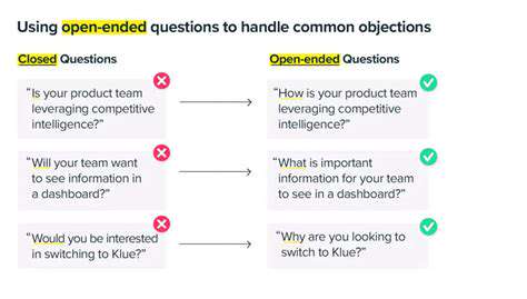
Anticipate objections by preparing bridge statements that transition from criticism to your key messages. For hostile questions, practice the affirm-redirect technique: That's an important concern. What our data shows is... Handling challenges gracefully often earns more respect than flawless delivery.


![Guide to Learning [Specific Programming Language, e.g., JavaScript]](/static/images/32/2025-05/DelvingintoFunctionsandMethods3ABuildingBlocksofReusability.jpg)